Thursday 6 May 2010

Reflection

Throughout this course looking at the different techniques photographers use to produce their images, has helped me to understand why certain angles, colours, shapes, focal points etc, make for a good photograph. The viewers eye can be made to follow certain routes round an image, using these techniques. The photographer can evoke an emotion using these techniques.
Iv learnt how to use the cameras fully manual modes. Understanding how changing one setting can affect another. For example if i were to lower the shutter speed, then i would have to use a smaller aperture, to ensure the photo isn't over exposed. This would then give me a larger depth of field, and more of the image would be in focus.
Looking at the health and Safety At Work Act, along with the Wildlife And countryside Act, i can see how easily a photographer may affect the environment around them. For instance a photographer may be out in a field taking pictures of a sunset, and could come across a birds nest in a hedge, without realizing it they could disturb the nest, and could cause upset to the animals in or around it. Also if a photographer was in a studio and not paying much attention to the equipment there using, or not using them correctly they could be putting themselves and other people at risk.
I feel Ive learnt a lot from this course, its pushed me to go out and experiment with my camera a bit more. From looking at other photographers work i have gained a lot of inspiration that has helped me to produce the final twelve images for my portfolio.
Looking at other work has helped me to develop my own style. Its helped me to realize that its better to keep things simple, and not over complicate an image (lots of focal points, subjects, things which distract the eye from the main subject etc).

Titles For Images

The Phonebox

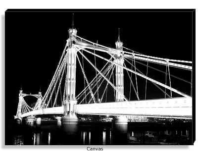
Westminster

The Eye

Twilight

Fountain

Lonely Palace

The Palace

Golf Sale

485

Skate Park

Cold Tree

Sunset

These are the titles for my images. Most of them are stating the obvious. I wanted to keep it simple and not go overboard with it. They say what is in the image, be it time of day, object or place. Letting the viewer know straight away what is happening, very to the point. 
Sometimes the title of an image can make the viewer think about what the photographer is trying to say.

Editing in Photoshop


After first deciding to size my print out at A3 i edited all my images to this size using Photoshop. I then shopped around looking for a good price. I found that the average price of an A3 was about £6, which is too expensive for me. So i now have decided to print my photos out at 10x15, which works out at half the price. Iv gone back through all my photos and resized them to fit.
I have included a screen grab of me cropping the photos to 10x15 in Photoshop (bottom photo). Along with some screen grabs of the editing process i used to get the final images (first two photos).


Thursday 29 April 2010

Developing images for final portfolio


On one of my skate park images there are some trees in the background, one of which has a birds nest in. After deciding that this was too much of a distraction within the photo, i edited out the nest using photoshop. 
Using the clone tool i replaced the nest with some of the surrounding trees, making it stand out less for the viewer. I then used the mask tool to select the area with the trees, and desaturate them so that they are not as noticeable. 
Above there are is the images before and after i edited them. Also there is a screen grab of the mask tool around the trees.

Thursday 15 April 2010

London Photos


I went to London yesterday and got a few good shots of the city. Hopefully i will be able to include some of these in my final portfolio at the end of this course.
Heres a link to some of the ones i took http://picasaweb.google.co.uk/118081212741511551550/London2010#

Thursday 1 April 2010

Tilt Shift Photography


After talking to Steve this evening, he suggested looking into tilt shift photography, and possibly tying to take suitable photos down in London, which could then be altered in photoshop later on.

Tilt-Shift miniature faking is a creative technique whereby a photograph of a life-size location or object is manipulated to give an optical illusion of a photograph of a miniature scale model. Altering the focus of the photography in photoshop (or a similar program) simulates the shallow depth of field normally encountered with macro lenses making the scene seem much smaller than it actually is.

I do like the effect it creates in the image, making the subject appear miniature, altho i do feel that it doesn't work with everything. Having looked around the web iv seen a lot of photos which have been post produced to be a tilt shift photo, most of these work well given the subject, where as a few look silly, i don't think editing the image has done much to improve the photo. The photo above of Big Ben at night has had the clock face blurred out along with the background, and the bridge left in focus underneath. The bridge looks really good, the people appear miniature. I feel that had the clock face been in focus more, but still leaving the back ground out of focus it would look better. A lot like the other photo of Big Ben i have posted above (the day time photo), it has the clock face still in focus leaving the background out of focus. I must prefer this to the other photo, leaving the clock face out of focus spoils it a bit. The second photo was taken from a high point, maybe this helps to keep that miniature feeling.
I love the photo at the very top of this post, the one of the Eiffel Tower. It makes the people below it seem like ants. I also love the strong colour of the green in the background. 

I will try to compose a few images that will be suitable for this kind of post production while i am down in London. However i don't feel like id do a lot of them for my portfolio. Id prefer to keep a more realistic feel to my images. Thats not to say i don't like Tilt Shift photos, i do like the way they can transform certain images, making the viewer think twice about what they are seeing. Its just id rather my photos give a more real impression of the scene.

I will still be able to use my Nikon D3000, along with the 18- 55 mm kit lens to take these types of photos, as they can be edited later on in Photoshop.

Thursday 18 March 2010

Richard Graham Photography


With my upcoming trip to london next month, iv been looking more at urban landscape photographers. I found Richard Graham Photography very interesting specifically the London photos he does (altho i have included some of his New York work as well). All of his London images are in black and white, something iv always been interested in. If there is no colours then the viewer is drawn to the shapes instead. Colours tend to distract from image. 
I intend to take photos in black and white down in london.  Post process them later on in photoshop.
I realize a lot of the photos i may take down there could possibly fall under the category of architecture. This being dew to the amount of buildings in London. The photos i have included here from Richard's work are of both architecture, and landscape. I do like the idea of photographing architecture, particularly older buildings. So if i am able to somehow incorporate this into my landscape photos then i will be happy.
I like Richard's image of the Thames with  the London Eye, along with Big Ben in the background. The water is in the lower third of the photograph, then the bridge on top of that with The London Eye to the far left of the image. Then Big Ben is in the centre of the image, which is relatively small, dew to it being a lot further away than the London Eye. The photo could of been taken on a gloomy day because of it being turned into a black and white image. You don't necessarily need to wait around till sunset, or get up for the sunrise to get an image like this, because all the colour has been taken out, so its difficult to tell which time of day it is. Its more the shapes and contrast in the image that the person is dawn to. The first thing i noticed in this picture was the London Eye dew to it being the most dominant part of the image, it stands taller than the rest of the buildings on the horizon. My eye then travels right along the bridge to Big Ben, in the middle of the photo.
Another of his photos which i like is the one of Millennium Bridge, with St Paul's in the background. My eye follows the bridge from left to right, then ending on St Paul's in the background. I also noticed that there is no clouds in the sky, which if there were may be distracting from the two main subjects. 
Iv seen quite a few photos of St Paul's, and the Millennium Bridge most of which were taken a night, which i think look really stunning.
This is something else which i hope to be able to try when I'm down there, id like to take a photo of the Thames at night, with the London Eye in the background all lit up. I don't yet have a tripod ( if i did, i don't fancy trekking it with me all round London) so i will try to rest the camera on a ledge over looking the river, and use a remote shutter release to activate the shutter, so not to blur the image with camera shake.


Wednesday 17 March 2010

New Landscape Photos


Today i went out round Tamworth with the aim of getting some good landscape photos which i might possibly use in my portfolio. I had a few rough ideas of what, and where i was going to shoot. Tamworth has two rivers running through it, so i headed over to the castle grounds to try to grab a few shots by the riverside. I was hoping to get a few photos with the castle in the background, or maybe some of the bridges they have going over the river.
When i got there the sun was out, which was great because it lit up the bridge over the water better, along with the castle. I managed to get some good shots with the river, the bridge and the castle in the distance. Then the sun went behind the clouds so i had to keep adjusting my shutter speed to avoid under exposing the images. I kept my ISO at 100 all the time, so i got the best quality images i could.
I then was going to head over to the small nature reserve in Fazley, to try and get some photos of fields, with the birds sitting on the lake. As i walked over there i noticed the old skate park was empty, so changed my mind and went over to grab a few shots of the park instead. I thought this would be good to include in my portfolio, as its an urban landscape rather than a rural one. All of my photos Ive taken previously have been rural.
All of the walls have been covered with graffiti, leaving the park very colourful, which is something Ive wanted to include in my images. I like bright colours. I took the photos from low down near the ground, to make the ramps n rails appear bigger. Also leaving room to include the various images in graffiti on the walls. I managed to get some of the best shots of the day there.
Next to the park theres a lake, a few ducks and geese like to hang around the water so i tryed to take some photos of them. I was able to get good shots of them while they were near the edge, but when they went a bit further out, my lens was unable to zoom far enough to take a good photo. If i had a telephoto lens, this wouldn't have been such a problem. 
I managed to get some good shots of the geese standing on the waters edge looking out onto the lake.
I will add the photos from today onto my Picsa site for you to view. I have also editied a few over on my Flickr page.
http://picasaweb.google.com/118081212741511551550/TamworthLandscapePhotos#

Thursday 11 March 2010

David Ward Landscape Photographer


Iv been looking at the work of David Ward. I really like the images he is able to produce. Some of the images are very simple and seemingly easy to reproduce. One photo is simply a path leading out into the water, leading the viewer eye straight up the photo. It uses soft light, which makes the image seem more peaceful. 
Not all of his photos are like this, some are cleverly composed. They make the subjects appear larger than they are, or he uses reflections in the foreground to move the viewers eye across the page. One photo when i first saw it i thought had a hole in the rock, but in-fact it was a pool of water, David had used the reflection of the sun as the foreground. 
Most of his images show the sun off to one side, this uses the rule of thirds, making the photo more visually pleasing, other than just placing the sun in the centre of the photo.
One photo shows a tree to one side, with a mountain in the background as a stream flows through the middle of the image. When you first look at the photo your eyes immediately drawn towards the stream, which then leads your eye up the photo towards the tree, then at last your eyes settle on the mountains in the background. I find the tree to be the main focus point of the image, dew to it being the most unusual part of the photo. I also like the colour of the sky, the dark blues give the feeling of cold, it looks as tho a storm is about to begin.